Media Queries
When you make a website, you tend to make it fit to your display, but this can make it incredibly annoying for others on different displays, e.g: phones.
Built into Chromium and Firefox (and likely other browsers) is a website viewer that you can use to change the size of a website’s display, allowing you to emulate a different screen size.
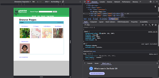
Responsive mode tends to be the easiest mode for fitting your website onto all screen sizes.
Media queries are represented as:
@media screen and (max-width: 550px) {

}
where
max-width: 550px can be changed to any requirements.CSS Code can be placed within this to take place when those requirements are met.
In a very simple example, this can be used to change the colour of the page when it’s on a smaller screen.
@media screen and (max-width: 550px) {

    body,html{

        background-color: blue;

    }

}
Seen here
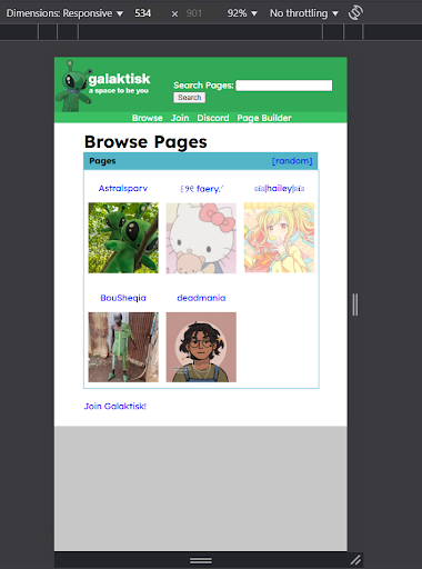
We can now apply this into a more useful scenario, e.g: making a grid fit on a webpage!
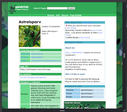
For this, Galaktisk will be used as an example.
This is incredibly important as, without media queries to fit stuff into mobile, this webpage would look like this:
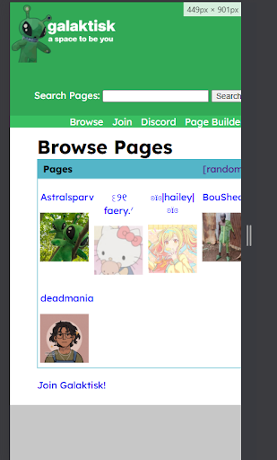
on a smaller screen - very unpleasing to the eyes and it doesn’t even fit the page.
This section of the webpage’s code is this:
.pages{

    display: grid;

    grid-template-columns: repeat(4,1fr);

    border: 1px solid rgb(84, 181, 200);

    margin-bottom: 5%;

    width: 100%;

}
On thinner screens, the grid-template-columns property will have to decrease, to do this, we use something called a media query.
When testing it’s found that at screen sizes 550px and less, the grid doesn’t fit, so we can use that as our max-width property.
@media screen and (max-width: 550px) {

}
Anything within these brackets will now change the styling if it’s within those requirements, in this case, max-width: 550px.
What we can do, is change the
grid-template-columns for .pages through this to be 3 columns instead of 4.Seen in this code:
@media screen and (max-width: 550px) {

    .pages{grid-template-columns: repeat(3,1fr);}

}
Now, at smaller sizes, the grid fits more objects.
This can be repeated to fit the entire grid, until it acts as simply one column of pages on very small screens.
Media queries can be used with other parts of the webpage, e.g: getting the container to take full advantage of the screen size when it’s on a smaller screen.
This can be seen with
@media screen and (max-width: 850px) {

    .main{width:100%;}

    nav{width:100%;}

}
by making
.main (the object containing the actual displayed webpage) and nav (the navbar of the page) 100% of the width, rather than the previous 60% on wider screens.This is also used within Galaktisk Pages, changing the container from a flex display to a block display, allowing the screen to fit comfortably.
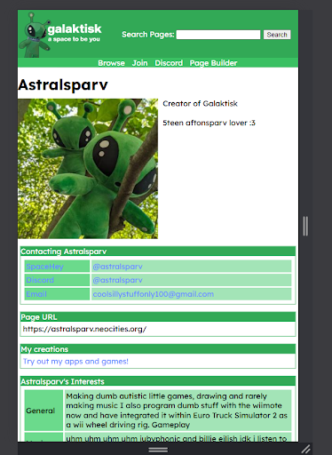
Code for Galaktisk pages is found here for you to see how that works!
See developer.mozilla.org for more information on media queries.
May your websites be friendly to all devices.